

A Bad Bad Sign
A Bad Bad Sign
This Is Becoming Serious

Below is an assessment of the performance of some of the most important sectors and asset classes relative to each other with an interpretation of what underlying market dynamics may be signaling about the future direction of risk-taking by investors. The below charts are all price ratios which show the underlying trend of the numerator relative to the denominator. A rising price ratio means the numerator is outperforming (up more/down less) the denominator. A falling price ratio means underperformance.
LEADERS: THE RUN FOR UTILITIES CONTINUES & THAT’S A BAD SIGN FOR THE MARKETS
Utilities (XLU) – This Is Becoming Serious For Market Bulls

Utilities have managed to carry forward this powerful move for its third consecutive week, dismissing at least some of the notion that this is simply a one-off bounce. This move in and of itself signals a shift in equity market sentiment, but the fact that other defensive strategies are starting to join in, Treasury yields are surging and even high yield spreads are starting to move higher makes it that much more concerning for market bulls.
Consumer Staples (XLP) – Need To Confirm Utilities

Staples have been a steady laggard throughout the past five months, so it’s encouraging to see them swing back into favor here to confirm the utilities move. This is likely a trend that needs to continue for a firmer risk-off trade since advances in utilities minus confirmation from staples have had troubling maintaining strength.
Health Care (XLV) – Not A Leading Indicator
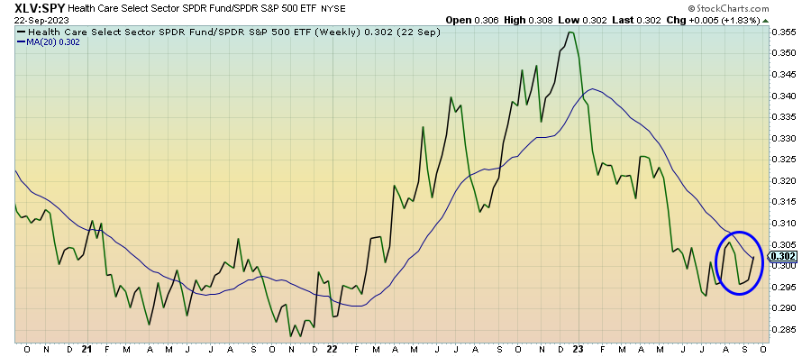
Healthcare has strung together two consecutive weeks of advances relative to the S&P 500, but there’s still too much chop here to consider it a sustainable move. Healthcare stocks generally fly under the radar when there’s no big headline risk to speak of. I think this sector will get on board if the current risk-off mood has legs, but it won’t necessarily be a leading indicator.
Communication Services (XLC) – A Mirage

It defies conventional wisdom a bit when a growth-oriented sector, such as this one, continues outperforming during a defensive pivot, but that’s what we have here. The equal weight version of this sector hasn’t done nearly as well as the cap-weighted version has (in fact, it’s underperformed the S&P 500 by a fair margin), so this chart is a bit of a mirage. This is all dependent on what you think of Facebook and Alphabet.
Energy (XLE) – Is $100 Oil On The Way?
Keep reading with a 7-day free trial
Subscribe to The Lead-Lag Report to keep reading this post and get 7 days of free access to the full post archives.