

The Core Of The Economy Is Slowing
The Core Of The Economy Is Slowing
The Dream Sequence

Below is an assessment of the performance of some of the most important sectors and asset classes relative to each other with an interpretation of what underlying market dynamics may be signaling about the future direction of risk-taking by investors. The below charts are all price ratios which show the underlying trend of the numerator relative to the denominator. A rising price ratio means the numerator is outperforming (up more/down less) the denominator. A falling price ratio means underperformance.
LEADERS: THE GREAT ROTATION, PART 2
Technology (XLK) – A Round Trip Return

Mega-caps have resumed their position as market drivers, marking a return to the conditions that led to leadership in just a select few stocks. Even as the reverse yen carry trade unwound a lot of leverage that had built up in this sector, it appears that the core investor preference for this segment of the market never waned in a significant way. The overall yen short position doesn’t look like it’s completely unwound though, so the risk of a repeat is high if volatility ticks up again.
Utilities (XLU) – Bubbling Under
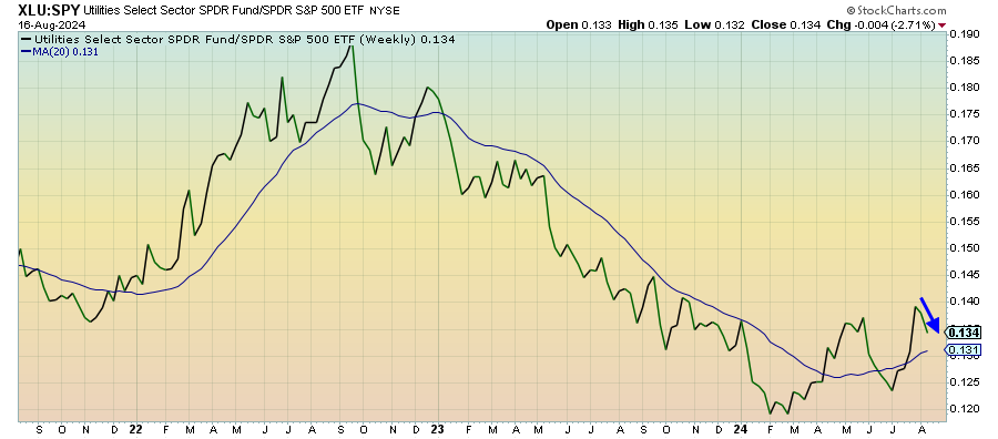
Utilities have begun to struggle again as tech returns to its former dominance. There’s too much going on with other risk-off assets, especially gold and Treasuries, to think that there’s too much strength in this downturn. Last week’s slate of better than expected data has helped swing the momentum in the risk-on direction, but I suspect that utilities are still bubbling under and ready to recover.
Communication Services (XLC) – Weakening Trend In The Mag 7
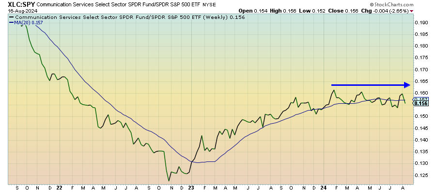
Communication services stocks have again disconnected themselves from tech in recent weeks. As tech plunges and rallies, this sector has remained remarkably steady with the broader market. It looks like the magnificent 7 stocks aren’t having quite as much pull in this current rally as they have over the past 18 months. Perhaps that’s a sign that the market is broadening out (unlikely). Perhaps it’s a sign that previous market leaders are weakening.
Long Bonds (VLGSX) – Reflecting Rates, Not Risk-Off

Treasuries have been on a slow, steady rise over the past several months, but this chart shows that, even during the VIX spike of a couple weeks, nothing has really stood out decisively as a risk-off moment. In general, this looks like a move more reflective of the anticipation of rate cuts later this year instead of pure risk-off. Although, I think the time for long bonds is nearing once credit spreads start to move.
Junk Debt (JNK) – Risk Slowly Getting Priced In
Keep reading with a 7-day free trial
Subscribe to The Lead-Lag Report to keep reading this post and get 7 days of free access to the full post archives.