

The Lags Are Starting To Hit
The Lags Are Starting To Hit
From Ash To Fire

Below is an assessment of the performance of some of the most important sectors and asset classes relative to each other with an interpretation of what underlying market dynamics may be signaling about the future direction of risk-taking by investors. The below charts are all price ratios which show the underlying trend of the numerator relative to the denominator. A rising price ratio means the numerator is outperforming (up more/down less) the denominator. A falling price ratio means underperformance.
LEADERS: UTILITIES DOMINATING; TREASURIES STEPPING UP
Utilities (XLU) – Telling The Right Story
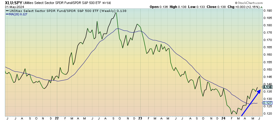
Utilities finished the month of May as the best-performing market sector despite the S&P 500 and Nasdaq 100 continuing to test new all-time highs. Renewed strength in Treasuries and the resilience of gold prices suggests there is still some defensive leadership underpinning this market. With several economic and earnings reports disappointing over the past several weeks and the risks in Japan & China looming over the global economy, I think this sector is telling the right story here.
Communication Services (XLC) – The Mean Reversion
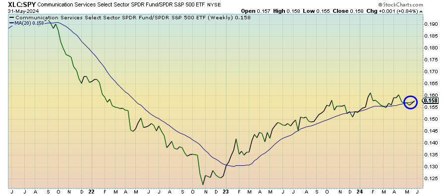
This sector has largely turned into a market performer, but the breadth within has actually improved. At one point recently, the cap-weighted version of this sector was the 2nd best performer of the year, but the equal-weight version was the 2nd worst. Now, those extremes are starting to mean-revert back towards the center. Of course, this sector likely remains tied closely to tech going forward.
Long Bonds (VLGSX) – Some Flight To Safety Momentum

It’s been a rocky road within the month of May as investors digested a lot of data, but the fact that the 10-year yield has fallen by more than 20 basis points in just a few days looks like it has a flight to safety element to it. We’ve seen disappointing data, including a slowing housing market, downwardly revised GDP and earnings misses, in just the past week and I think investors are genuinely starting to position themselves a little more defensively.
Treasury Inflation Protected Securities (SPIP) – Disinflationary Or Not?
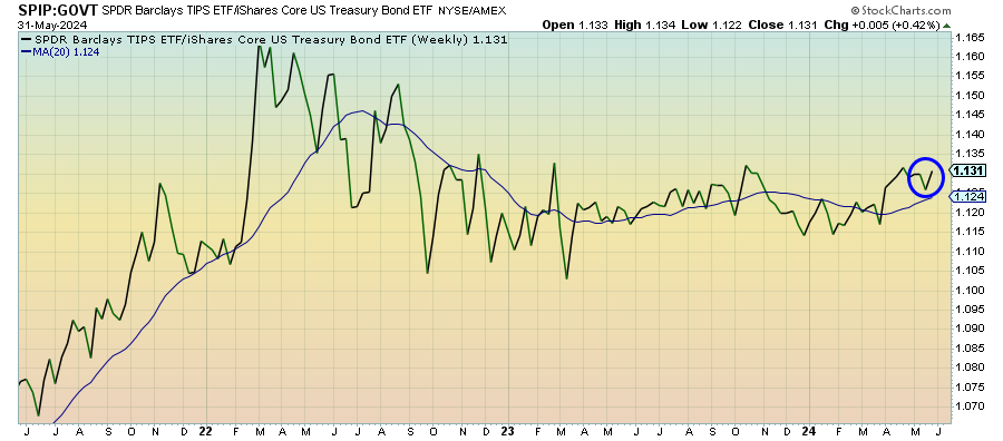
Inflation is still looking mostly sticky, both in the U.S. and worldwide, and market opinion seems split on whether the disinflationary trend is still intact or it’s stalled out. The slowdown we’re seeing on both the consumer and producer sides would certainly argue for a disinflationary environment, but we have yet to really see it play out. TIPS prices remain steady and suggest balanced risks currently in place.
Junk Debt (JNK) – Momentum Finally Fizzling Out
Keep reading with a 7-day free trial
Subscribe to The Lead-Lag Report to keep reading this post and get 7 days of free access to the full post archives.