

"The VIX Is Going To 0 Bro"
"The VIX Is Going To 0 Bro"
What Happens If Small-Caps Fail The Test?

Below is an assessment of the performance of some of the most important sectors and asset classes relative to each other with an interpretation of what underlying market dynamics may be signaling about the future direction of risk-taking by investors. The below charts are all price ratios which show the underlying trend of the numerator relative to the denominator. A rising price ratio means the numerator is outperforming (up more/down less) the denominator. A falling price ratio means underperformance.
LEADERS: SMALL-CAPS ARE THE KEY; SO FAR, THEY’RE PASSING THE TEST
Consumer Discretionary (XLY) – The Nike Jolt
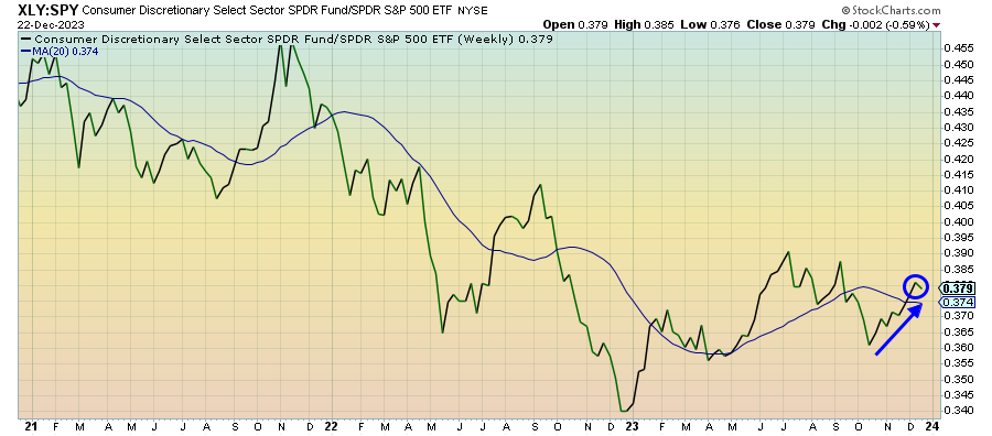
The big revenue warning from Nike should be a reminder that retailers will likely continue to struggle as consumers get worn and run out of resources to spend. The retail sales numbers for November and early holiday sales figures should shore up confidence in the near-term. The current risk-on sentiment will only exacerbate that confidence, but the longer-term outlook for discretionary stocks looks very mixed.
Financials (XLF) – The Cap On Treasury Yields
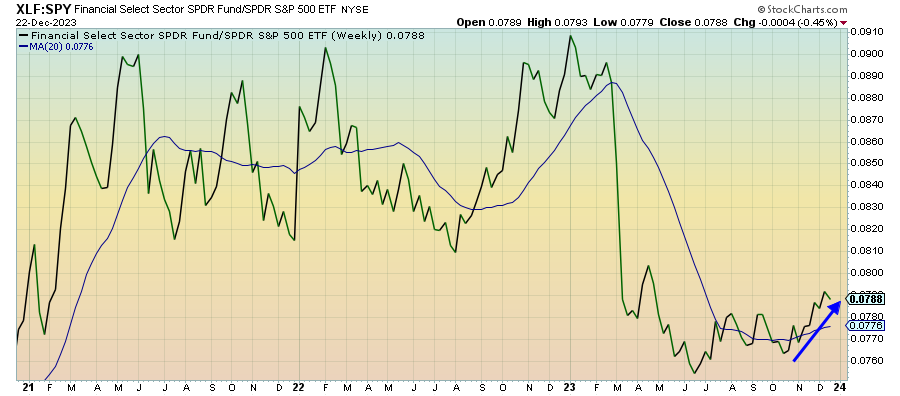
Depressed yields continue to support banks and financials. The ceiling for yields would seem to be in place for a little while, supported by the market’s expectation for aggressive central bank rate cuts in 2024 and the potential return of the flight to safety trade. That could make banks a good pick for the first part of the year, but the growing credit contraction could prove to be a fatal headwind eventually.
Industrials (XLI) – Emerging Supply Chain Issues
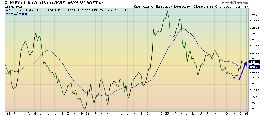
Cyclicals still remain in favor as overenthusiasm about a 2024 Fed easing cycle controls the narrative. While there’s been some pickup in activity, the global manufacturing environment is still in a rough place. The conflict in the Red Sea is already creating supply chain issues and a sharp increase in shipping costs. The longer that lasts, the more at risk the economic recovery is.
Materials (XLB) – Much Volatility, But Finally Starting To Accelerate

While cyclicals broadly are leading the market at the moment, the biggest gains are concentrated in financials and industrials. The materials sector has been pretty volatile, but the chart does show that it has been leading the S&P 500 in recent weeks. Base metals and chemicals have really picked up over the past couple weeks, which would be consistent with the overall cyclical recovery narrative.
Real Estate (XLRE) – High Correlation To Interest Rates
Keep reading with a 7-day free trial
Subscribe to The Lead-Lag Report to keep reading this post and get 7 days of free access to the full post archives.