

Unmasking the Tech Rally
Unmasking the Tech Rally
The Ultimate Evidence of a Market Headed for Trouble

Below is an assessment of the performance of some of the most important sectors and asset classes relative to each other with an interpretation of what underlying market dynamics may be signaling about the future direction of risk-taking by investors. The below charts are all price ratios which show the underlying trend of the numerator relative to the denominator. A rising price ratio means the numerator is outperforming (up more/down less) the denominator. A falling price ratio means underperformance.
LEADERS: THE TECH RALLY IS THE BEST EXAMPLE OF WHY THIS MARKET IS IN A BAD PLACE
Consumer Discretionary (XLY) – Caught Up In The Growth Wave
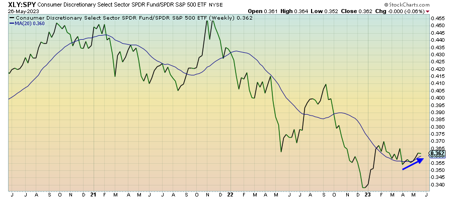
I think consumer discretionary stocks are getting pulled higher by the investor sentiment towards growth and high beta as opposed to anything fundamentally strong about the sector. Earnings for Q1 generally came in pretty positively, although we keep getting warnings from the retailers about slowing growth ahead. Conditions look pretty stable for now, but there’s going to come a time soon where investors are going to need to decide how far they want to press their luck.
Technology (XLK) – Drowning Out The Market
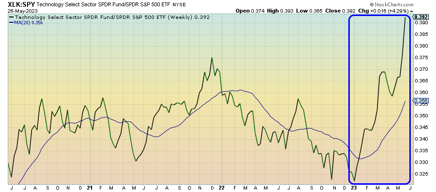
Even though the tech sector as a whole has performed well this year, make no mistake about it - this is all about a handful of mega-cap names and the sudden mania around AI. A chart like this suggests that we’re getting into bubble territory (perhaps not so ironically, this ratio is at its highest level since the tech bubble), which means the risk of a crash is VERY high. This sector is drowning out the rest of the market, which isn’t nearly as healthy as the averages might make it seem.
Communication Services (XLC) – Gains Are Incredibly Top-Heavy
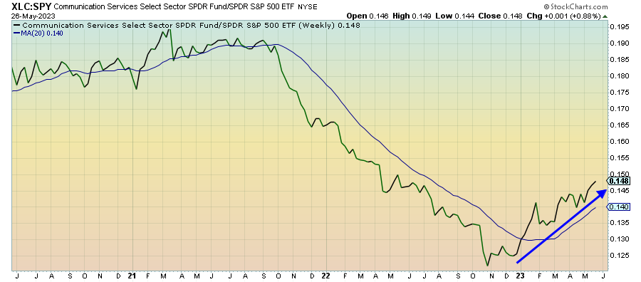
This tech-adjacent sector is also beating the S&P 500, but it’s also being driven by the gains in just two stocks. The equal weight version of this sector is trailing the cap-weighted version by 24% year-to-date. While this sector might not be quite as stretched as tech is, it certainly seems like it’s way out over its skis and vulnerable to a severe pullback.
Treasury Inflation Protected Securities (SPIP) – Neutral Positioning

The current path of inflation should see the headline rate bottom out in June or July and then move higher again followed by a persistent elevated period. This ratio is interesting because it doesn’t indicate investors necessarily positioning themselves one way or the other. While the broader market may be focused on inflation falling, the TIPS market doesn’t appear to share the enthusiasm.
Keep reading with a 7-day free trial
Subscribe to The Lead-Lag Report to keep reading this post and get 7 days of free access to the full post archives.